Magazine Ideas/Analysis for NEA
Masthead Ideas:
- DYNAMIC
- NOTION
- INFLUENCE
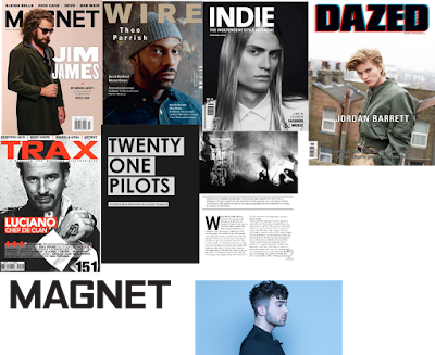
- For the font of my masthead , it will be bold, simplistic and sophisticated in capital blocks. The colour of the font will be black/white/or neutral colours to match the conventions of a modern indie/alternative magazine, as well as the complementing the main image( not overpowering yet not too vague).
- My magazine will be mainly focusing on indie/alternative/rock/synth music and artists. The magazine double page spread will be about my artist's music and recent song "Dancer in the Dark", it will cover the message he's trying to send and why it is important.
- The front cover will have a mast head, artist name and a pull quote with page number, it will be minimal and simplistic so that there's more focus going towards the artist himself.
- The double spread will have a different picture on the left side of the artist with small text of his recent single "Dancer in the Dark". The right side will have tombstone text and a drop cap which is a common convention used in magazines.

Comments
Post a Comment